
Witchsister is an all femme post-rock band from Fayetteville Arkansas. Their sound features haunting powerful vocals, strange and sometimes goofy guitar licks, fat aggressive bass tone, and complex but rock-centered drumming.
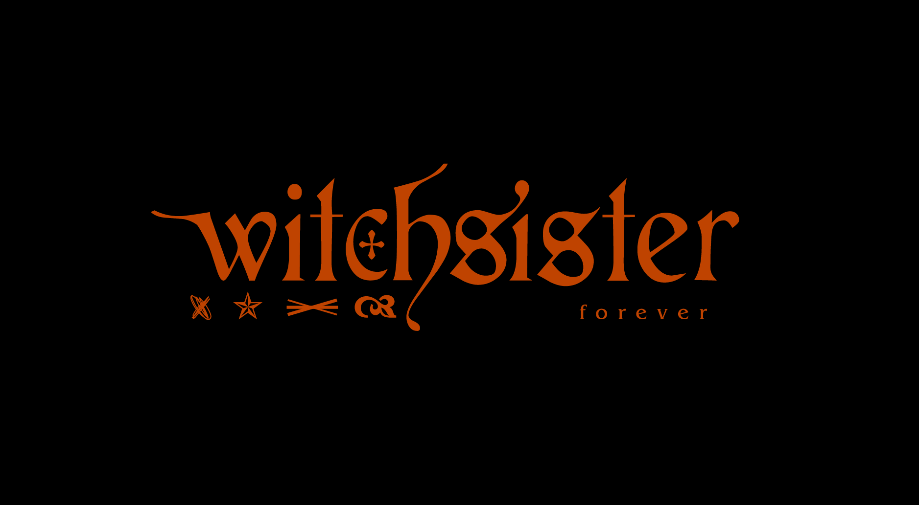
This brand system aims to balance the relationship between their rock roots, "feminine rage", and a since of witchy-whimsical-playfulness.
Typographically and aesthetically I wanted to harken back to their musical background which has deep roots in classic rock [Led Zeppelin and Black Sabbath] but with a strong sonic influence from late 90's and 2000's bands [Queens of the Stone Age, The Pretty Reckless, Muse, Rage Against The Machine, and Evanescence]


These Icons are a reference to alchemic symbols / witchcraft runes aswell as the four symbols use to represent the members of Led Zeppelin.


Any photography or imagery used in this system is to be broken down into two colors in a halftoning pattern. Imagery used is to be paintings of women committing violence against their oppressor's / violence as protest, ect. The value range is inverted to create mystery. Imagery can be zoomed into to create abstract textural experiences.


